Templates & Styling Reference
The Templates tab controls the entire look and behavior of your safelink interstitial — which template renders, how the action button and countdown work, how human verification gates bots, and the colors, fonts and logo applied across every page. This reference covers every field so you can match WP Safelink to your site’s branding.
Open WP Safelink → Settings and choose TEMPLATES in the sidebar. The tab merges the Templates and Styles sections into one place.
What it looks like
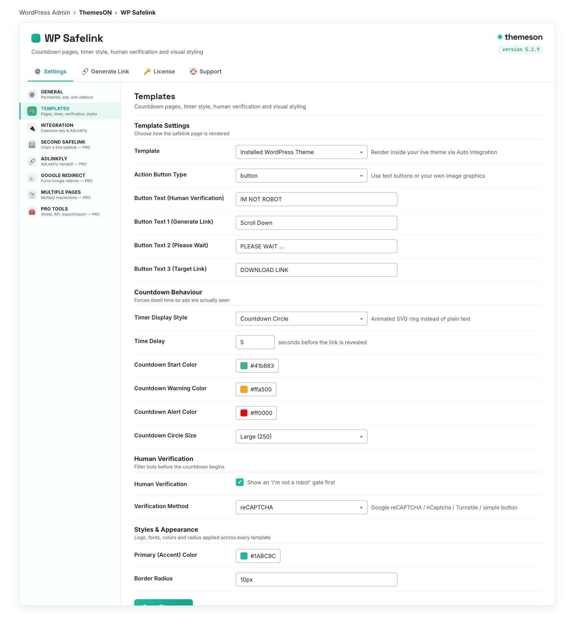
Template Settings
Pick how the safelink page is rendered. The default Installed WordPress Theme mode wraps the safelink in your real theme using Auto Integration, while template1 through template4 are self-contained monetization pages. See the Integration tab for how the extension plugins connect.
| Setting | Default | What it does |
|---|---|---|
| Template | installed — Installed WordPress Theme | Chooses the page layout. Options are the installed theme plus every file in the template folder (template1–template4). Installed-theme mode relies on Auto Integration instead of a standalone page. |
| Skip Verification | No | Template3 only. Auto-submits the verification screen so visitors skip the manual ‘I’m a Human’ step. |
| Enable Auto Integration | Yes | For template2/template3/installed-theme modes. Injects the safelink top and bottom blocks into your theme automatically, with no editing of header.php or footer.php. |
| Top Section Placement | after_title | Where the top safelink block is hooked: wp_body_open, before_title, after_title, or content_start. |
| Bottom Section Placement | content_end | Where the bottom safelink block is hooked: wp_footer, content_end, or after_content. |
| Hook Priority | 10 | The WordPress hook priority used when Auto Integration injects the blocks. Raise or lower it if another plugin or theme conflicts with placement. |
💡 Note: Not sure which template to pick? Start with Installed WordPress Theme + Auto Integration so the safelink looks like a native page on your site. Switch to template1 or template4 if you want a clean, fully branded standalone page with image buttons.
Action Button
The action button is the call-to-action visitors tap to move through each stage of the flow: Generate Link → Please Wait → Download Link (plus an optional Human Verification button). You can use plain text buttons or upload custom image buttons.
| Setting | Default | What it does |
|---|---|---|
| Manual Scroll to Get Link | Yes | Requires the visitor to scroll down to reveal the link, increasing exposure to your bottom ad slots. |
| Action Button Type | button | Use a styled text button or a custom image button graphic for every stage. |
| Image Button (Human Verification) | assets/human-verification4.png | Graphic used for the human-verification step when Action Button Type is image. |
| Image Button 1 (Generate Link) | assets/generate4.png | Graphic for the first stage that starts the countdown. |
| Image Button 2 (Please Wait) | assets/wait4.png | Graphic shown during the brief ‘please wait’ pause before the final link. |
| Image Button 3 (Target Link) | assets/target4.png | Graphic for the final download/target link button. |
| Button Text (Human Verification) | IM NOT ROBOT | Label on the human-verification button when using text buttons. |
| Button Text 1 (Generate Link) | Scroll Down | Label on the first stage button. |
| Button Text 2 (Please Wait) | PLEASE WAIT … | Label shown during the 2-second wait stage. |
| Button Text 3 (Target Link) | DOWNLOAD LINK | Label on the final download button that points at the real destination. |
Countdown Behavior
The countdown enforces dwell time so your ads are actually seen before the link is revealed. Choose between a simple text timer and an animated countdown circle, and tune its colors, thickness and size to match your design.
| Setting | Default | What it does |
|---|---|---|
| Timer Display Style | text | text shows a ‘links in {time} seconds’ message; countdown shows an animated SVG circle. |
| Time Delay | 5 | How many seconds the countdown runs before the link can be generated. |
| Time Delay Message | Thank you for your visit. Your links will be created in {time} seconds. | The message shown during the countdown. The {time} token is replaced with the live counter and HTML is supported. |
| Countdown Start Color | #41b883 | Color of the countdown circle at the start of the timer. |
| Countdown Warning Color | #ffa500 | Color applied during the last 10 seconds of the countdown. |
| Countdown Alert Color | #ff0000 | Color applied during the last 5 seconds of the countdown. |
| Circle Stroke Width | 2 — Ultra Thin | Thickness of the circle ring: 2 Ultra Thin, 4 Thin, 7 Normal, 10 Bold, 15 Extra Bold. |
| Countdown Circle Size | 250 — Large | Diameter of the circle: 150 Small, 200 Medium, 250 Large, 300 Extra Large. |
| Show Timer Text with Circle | Yes | Displays the numeric countdown text inside the circle as well. |
Human Verification
Human Verification filters out bots before they consume ad impressions, protecting your AdSense account. Use a simple click-to-verify button or plug in Google reCAPTCHA, hCaptcha, or Cloudflare Turnstile.
| Setting | Default | What it does |
|---|---|---|
| Human Verification | Yes | Master toggle for the verification gate that appears before the countdown. |
| Verification on Homepage | No | Template2 flow. Runs the verification step on the homepage instead of a random post. |
| Verification Method | button | button (click to verify), recaptcha, hcaptcha, or turnstile. |
| reCAPTCHA Site Key / Secret Key | (empty) | Your Google reCAPTCHA credentials, used when the method is recaptcha. |
| reCAPTCHA Label | Please complete reCAPTCHA verification | Prompt shown above the reCAPTCHA widget. |
| hCaptcha Site Key / Secret Key | (empty) | Your hCaptcha credentials, used when the method is hcaptcha. |
| hCaptcha Label | Please complete hCaptcha verification | Prompt shown above the hCaptcha widget. |
| Turnstile Site Key / Secret Key | (empty) | Your Cloudflare Turnstile credentials, used when the method is turnstile. |
| Turnstile Label | Please complete Cloudflare Turnstile verification | Prompt shown above the Turnstile widget. |
Styles & Appearance
The styling fields apply consistent branding — logo, fonts, colors and corner radius — across all templates and the safelink components. The accent color defaults to the Themeson teal so it looks polished out of the box.
| Setting | Default | What it does |
|---|---|---|
| Logo | assets/logo.png | The logo image shown in the safelink header. Upload your own to brand the page. |
| Font Family | system-ui | Typeface for the safelink UI: system-ui, inter, arial, roboto, or georgia. |
| Base Font Size | 16px | Base text size for the safelink page. |
| Text Color | #111827 | Main body text color. |
| Muted Color | #6b7280 | Secondary, less prominent text color. |
| Border Color | #e5e7eb | Color of borders and dividers on the page. |
| Background Color | #ffffff | Page background color. |
| Primary (Accent) Color | #1ABC9C | The main accent color used on buttons and highlights. |
| Primary Hover Color | #16A085 | Accent color on hover/active state. |
| Border Radius | 10px | Corner rounding applied to buttons, cards and inputs. |
💡 Note: The four bundled templates differ in layout: template1 is a modern standalone card, template2 wraps the safelink inside your real theme, template3 is a classic Bootstrap verifying page, and template4 is image-button based. Image buttons (template4 or Action Button Type = image) only use the Generate, Please Wait and Target graphics — set those before switching to image mode so visitors always see a CTA.
Was this article helpful?